Most users know that FRASER contains lots of text. What might be news is that users can also find photographs, audio, video, and maps. Maps are a form of storytelling; abstracting reality, they call out selective parts to illustrate a particular point of view. FRASER has an extensive selection of historical maps hidden in economic reports and documents. To help the user find maps that help tell an economic story, FRASER offers the following collections with maps in the documents.
Reserve Bank Organization Committee
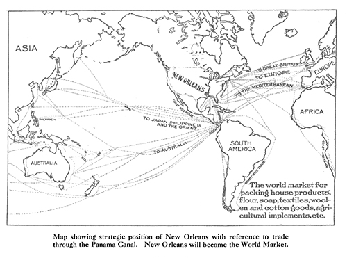
The first map-rich collection is the records of the Reserve Bank Organization Committee (RBOC), held at the National Archives and digitized for FRASER. The RBOC was charged with choosing the Reserve Bank cities, following the passage of the Federal Reserve Act in 1913. The testimony and exhibits from local leaders lobbying for their cities to be chosen are particularly interesting in terms of hearing regional voices promote their economy and the importance of their city. For instance, the leaders of New Orleans submitted a map to illustrate the centrality of the port of New Orleans for trade.
Similarly, Denver provided maps to illustrate its strategic location in the West. According to this particular map, Denver’s economic reach covers 804,360 square miles, making the city, leaders argued, the center of all economic activity in the West.
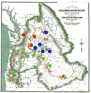
This map, submitted for Portland, Oregon, illustrates the city’s importance by emphasizing the rivers and the flow of water: All water grades lead to Portland.
Statistical Atlases of the United States
Next up is FRASER’s series of Statistical Atlases produced by the Census Bureau using the data from the decennial censuses. FRASER holds the complete collection: atlases of the 1870, 1880, 1890, 1900, 1910, 1920, 1970, and 2000 censuses. Each atlas is a powerful reflection of its historical context. The 1870 Statistical Atlas, for instance, vividly illustrates some of the outcomes of the Civil War: This map shows the imbalance of the male/female population in the United States. The frontier has an excess of males, while the South has an excess of females. This is not surprising, as it was five years after the end of the Civil War in the United States. The South had far fewer men than women because many men had moved west to pursue economic opportunities.
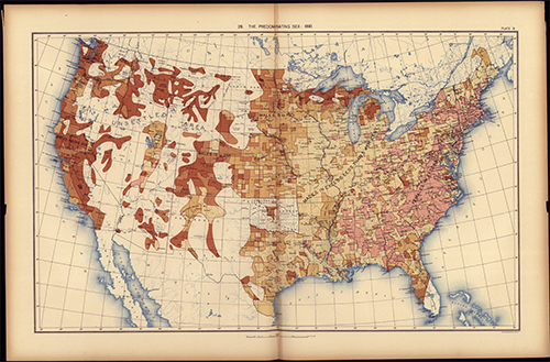
Following the 1880 census, the Census Bureau didn’t publish a Statistical Atlas, but Scribner’s publishing company did, with the help of geographic experts who had worked on earlier editions. This edition also contains a map showing the predominant sex in each area. The map covers the continental United States, but the plains states and the mountain west are largely unpopulated. It shows again more females in the South and more males in the West, particularly in California.
The Statistical Atlas from the 1890 census has the third version of this map. The frontier is still predominately male, and the southern and eastern states are predominately female in their populations. You can see that the plains states have begun to attract pioneers.
In the 1910 edition, the map continues, but in black and white. By this time, only a few states have more women than men—the newly settled West is more heavily male.
The 1970 edition, using data from the 1960 census, continues featuring the map and puts it back in color.
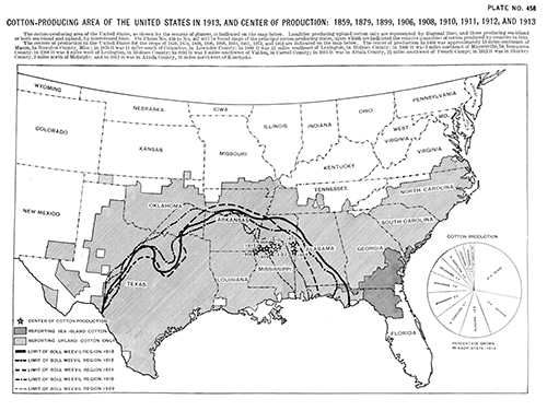
In addition to population maps, the Statistical Atlases also illustrate traditional economic indicators: centers of wealth, agriculture, and manufacturing. For instance, the Statistical Atlas based on the 1910 census provides many maps showing the distribution of farmland and crops. As well as an overall chapter on agriculture, the atlas contains a chapter devoted to cotton—an important crop to the national economy. Following is the map from that chapter.
Beyond the RBOC and the Statistical Atlases, many other documents in FRASER contain maps, even if they’re not a central feature of the publication. One example is from the publications of the National Monetary Commission.
One of its many publications describes the Clearing House system difficulties. A chapter describes the process by which a single check is cleared, and in that chapter a map was drawn to show the circuitous route taken to clear a check in its system.
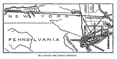
United States. National Monetary Commission. Typical Journey of a Country Check Remitted for a City Account, Clearing House Methods and Practices. 1911.
Finally, if you aren’t looking for anything specific, but love to see maps, one handy way to find maps on FRASER is to check out the @FedFRASER Twitter feed, under the “Media” tab. We regularly tweet map images as these are a quick way to illustrate the content in FRASER in less than 140 characters.
